
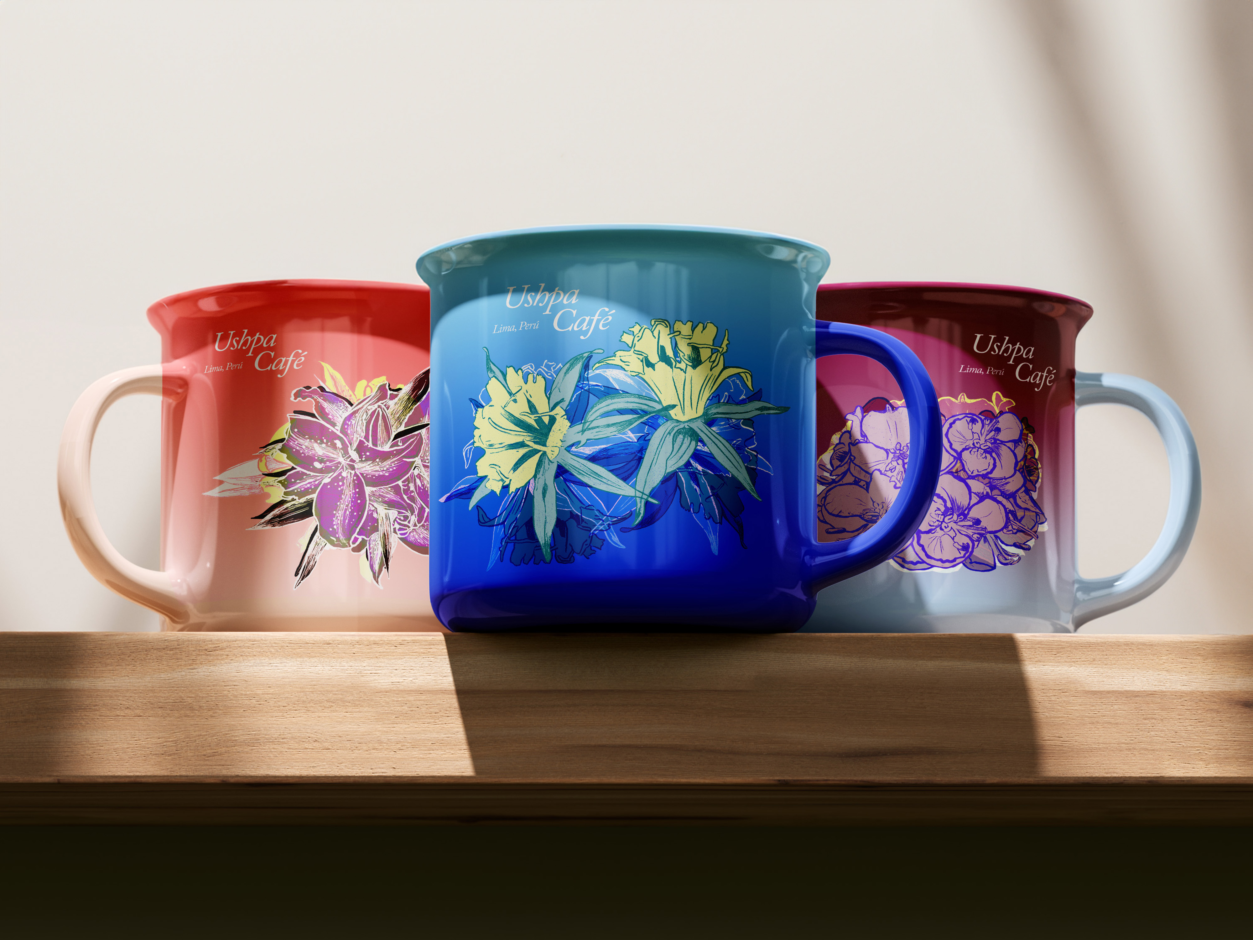
Ushpa Cafe
Visual Identity
Packaging
Print
Visual Identity
Packaging
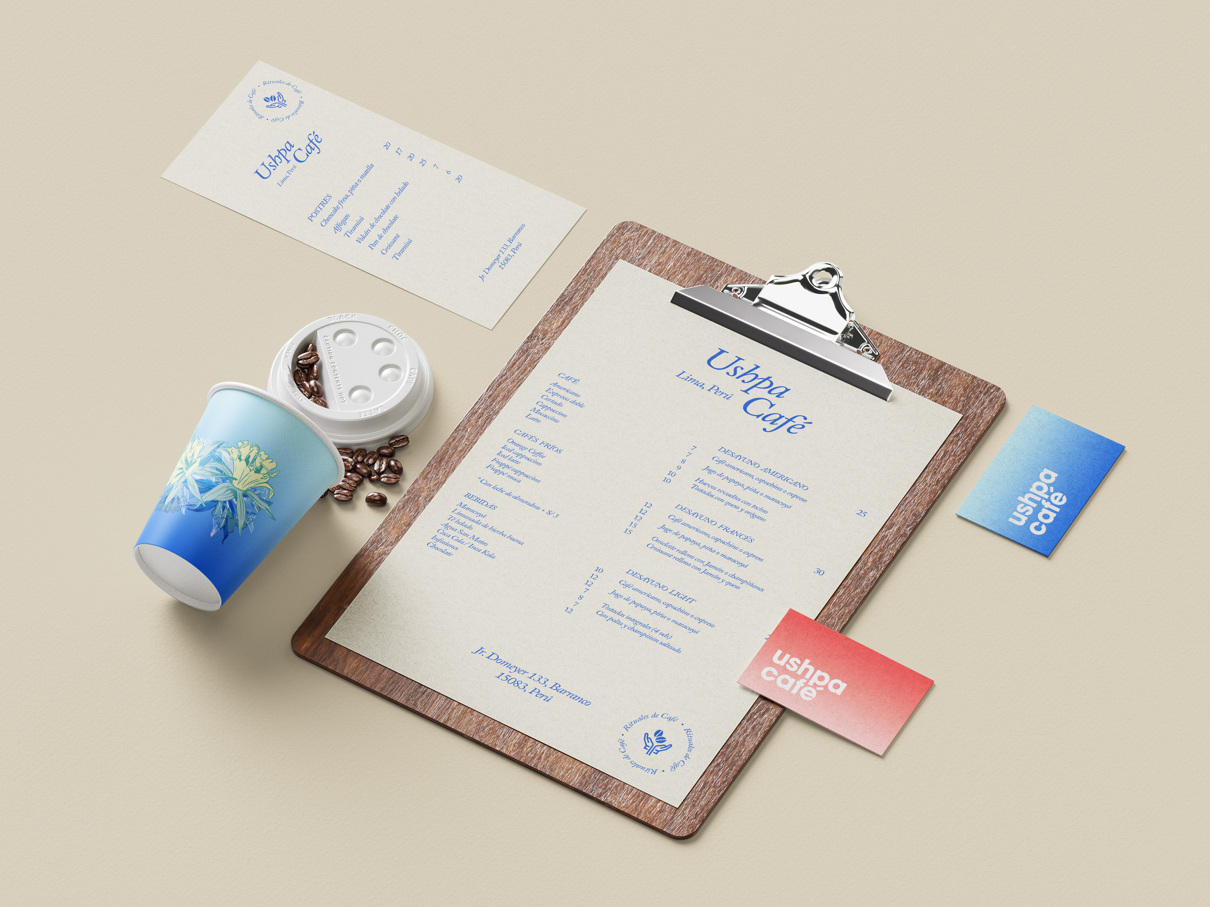
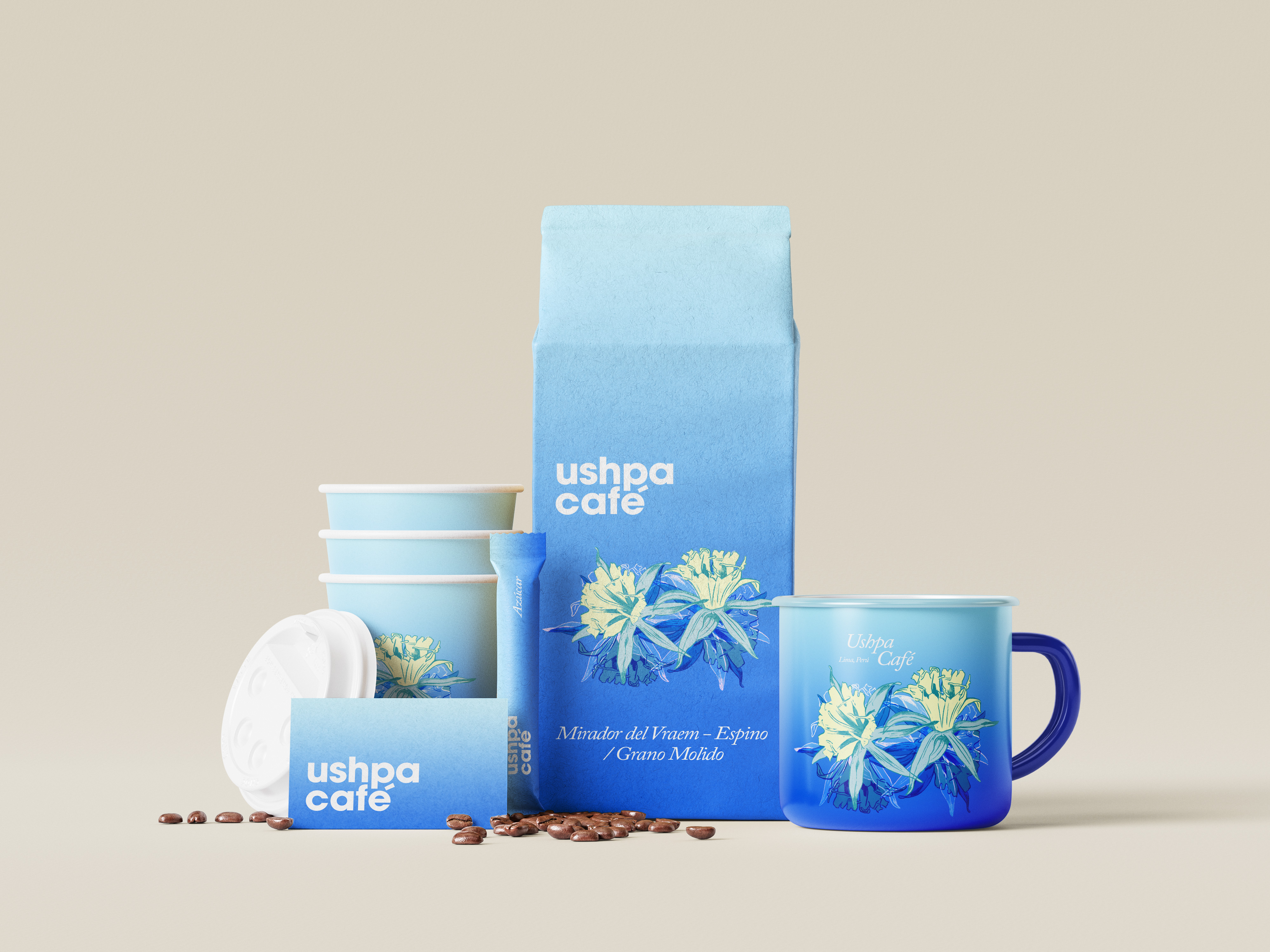
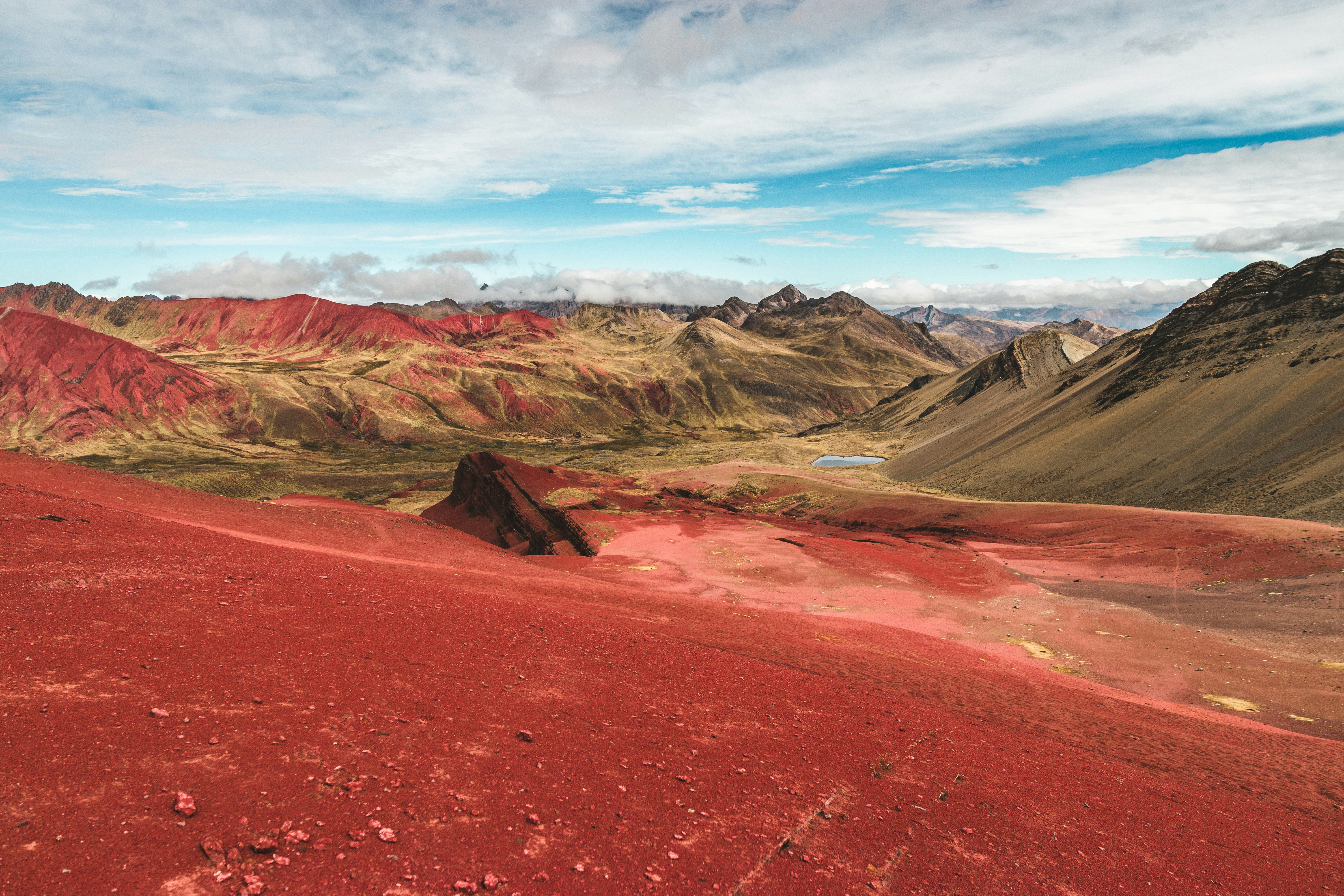
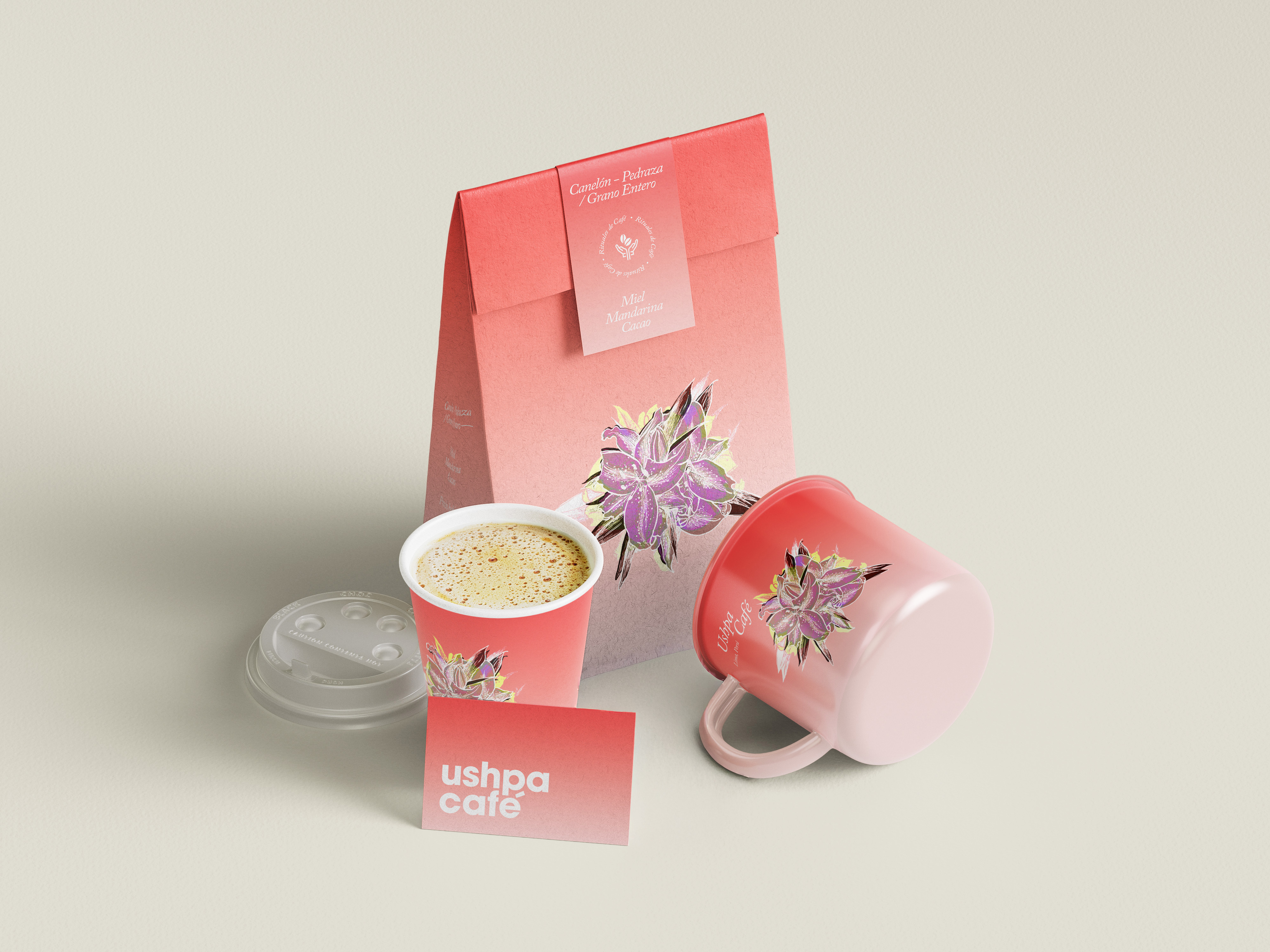
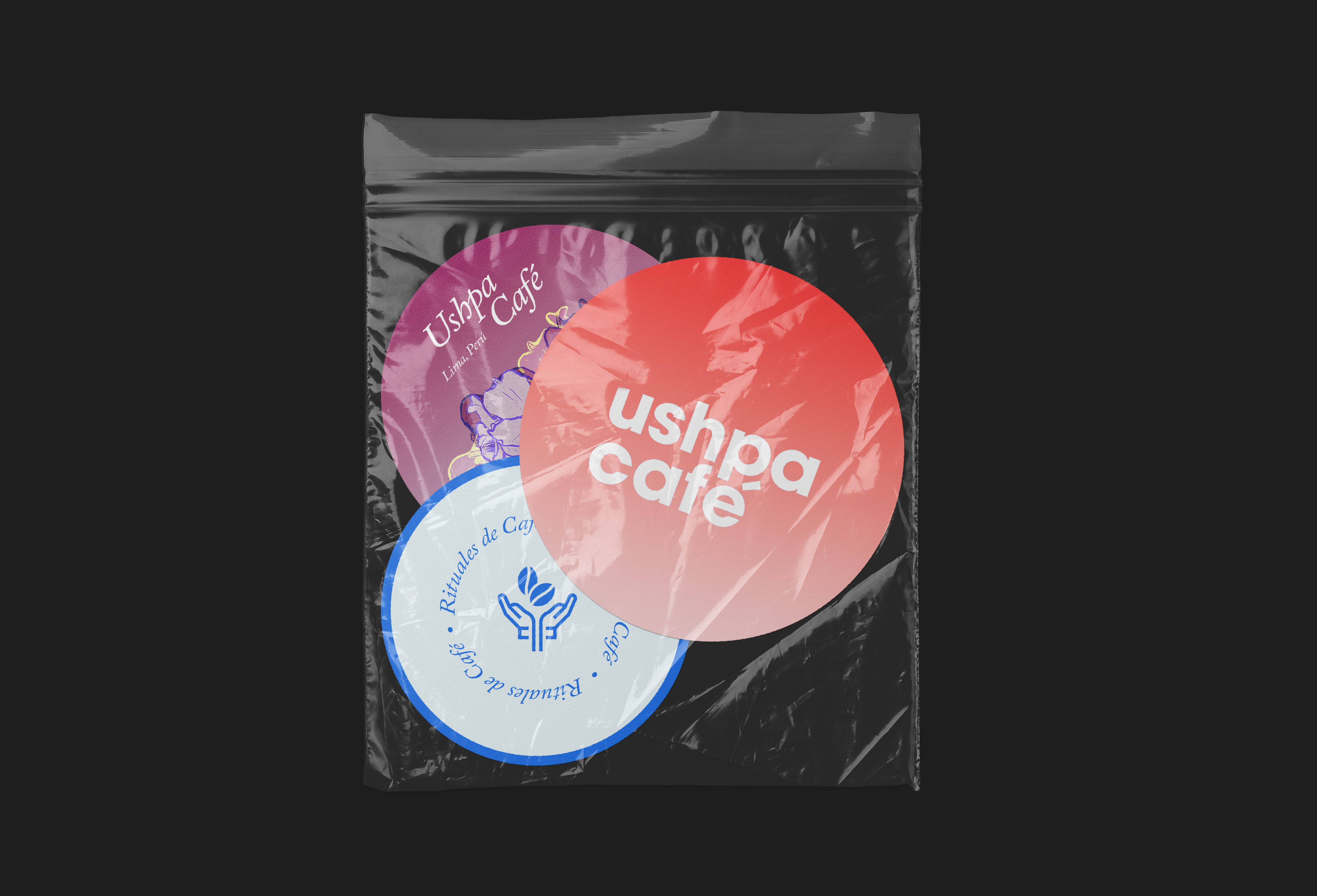
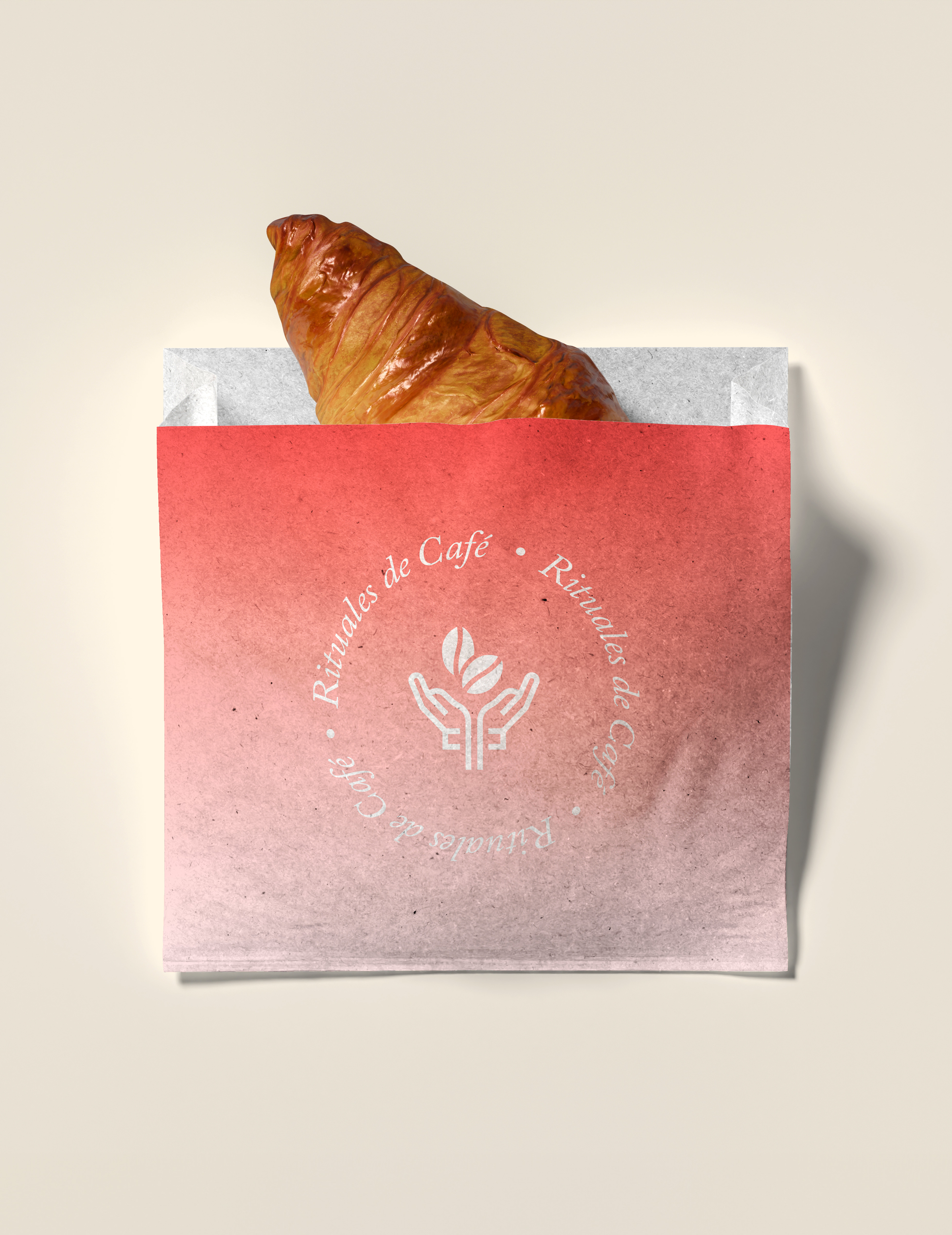
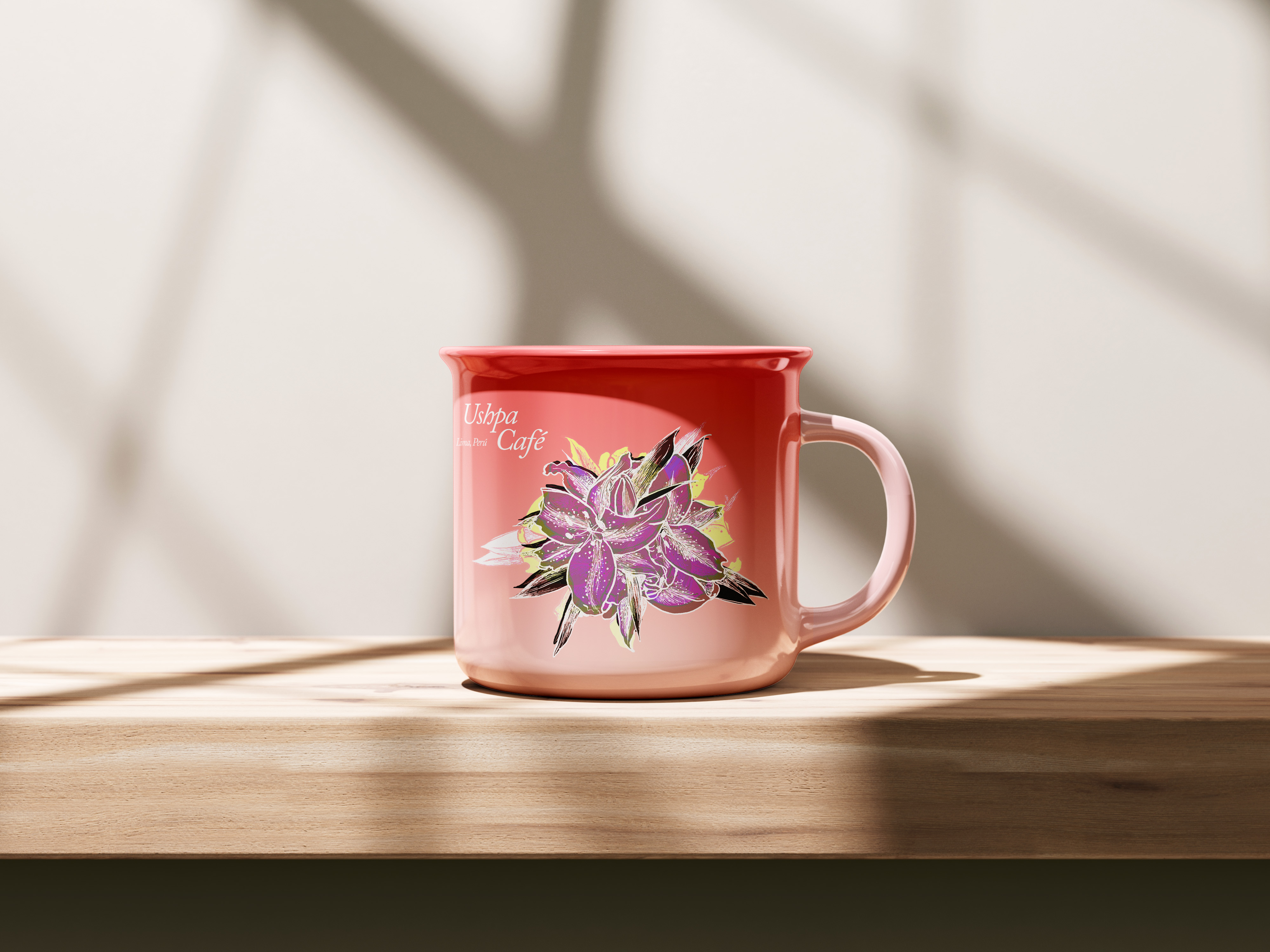
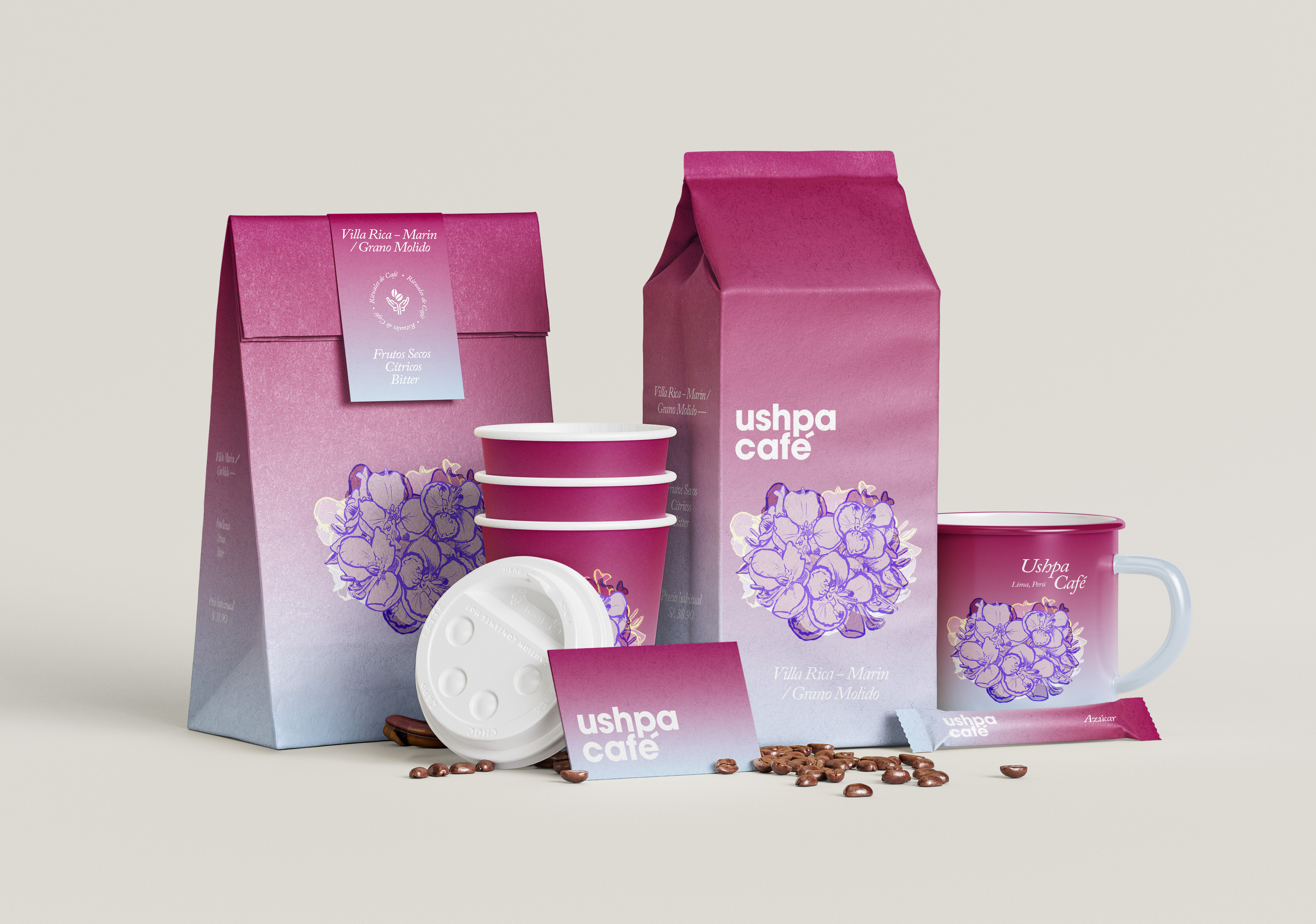
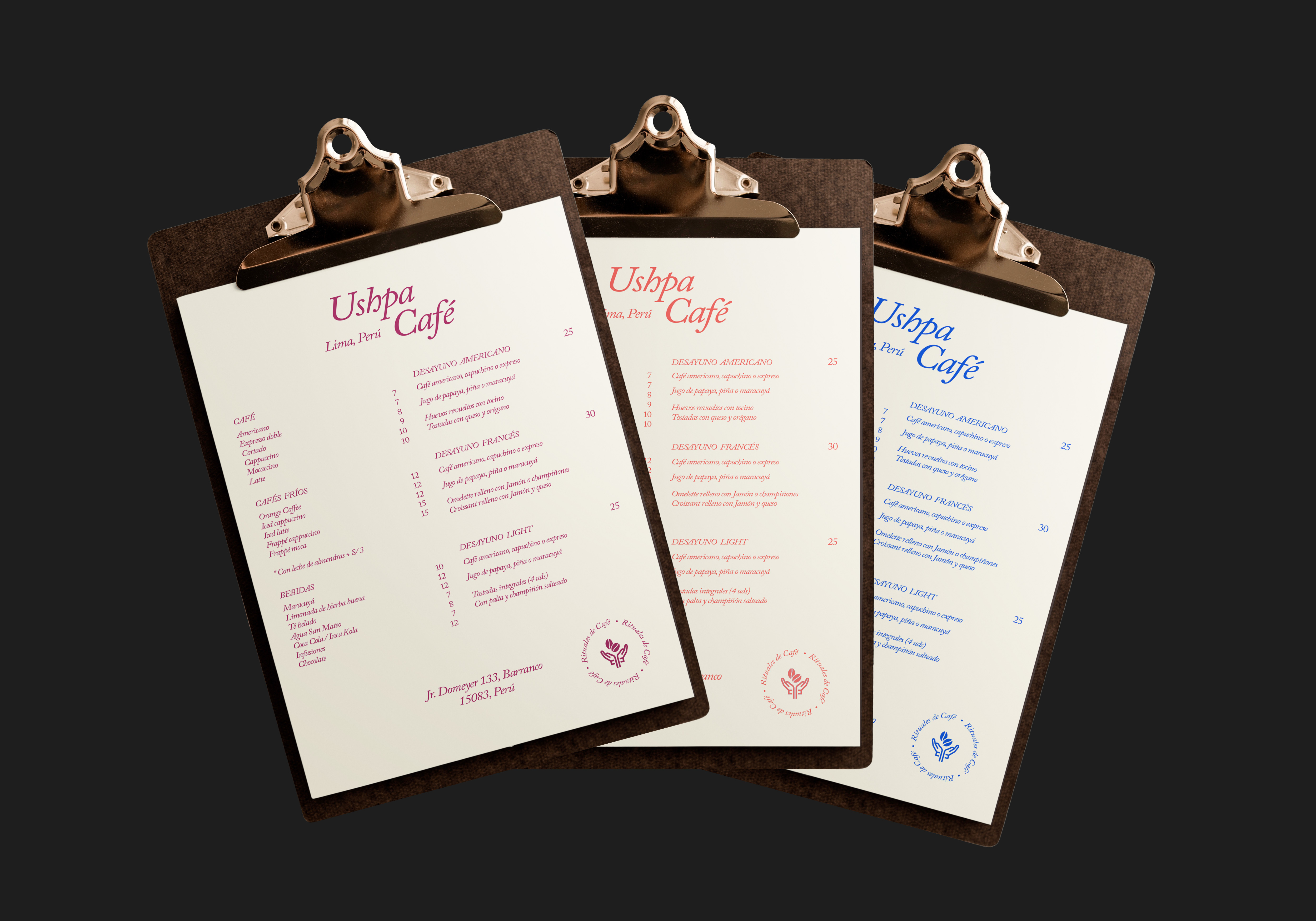
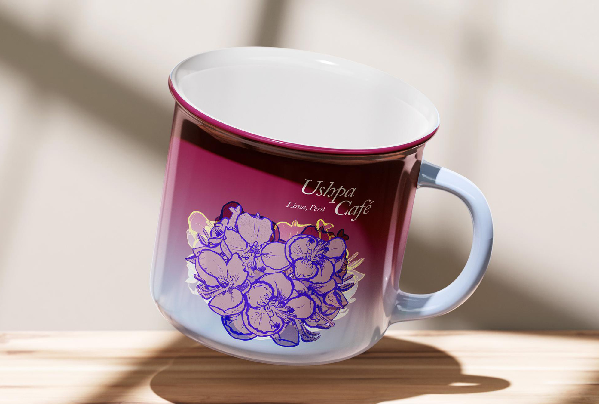
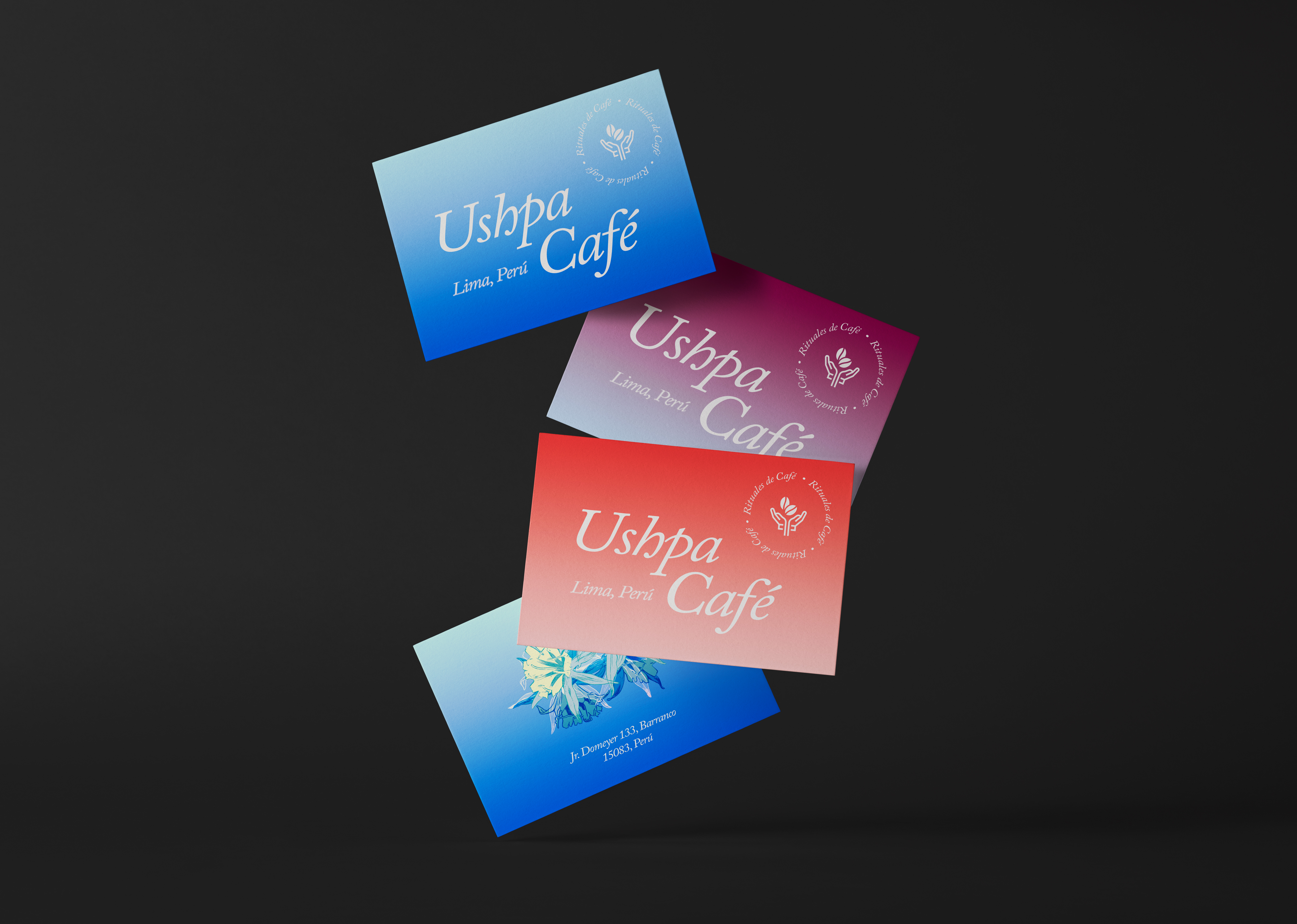
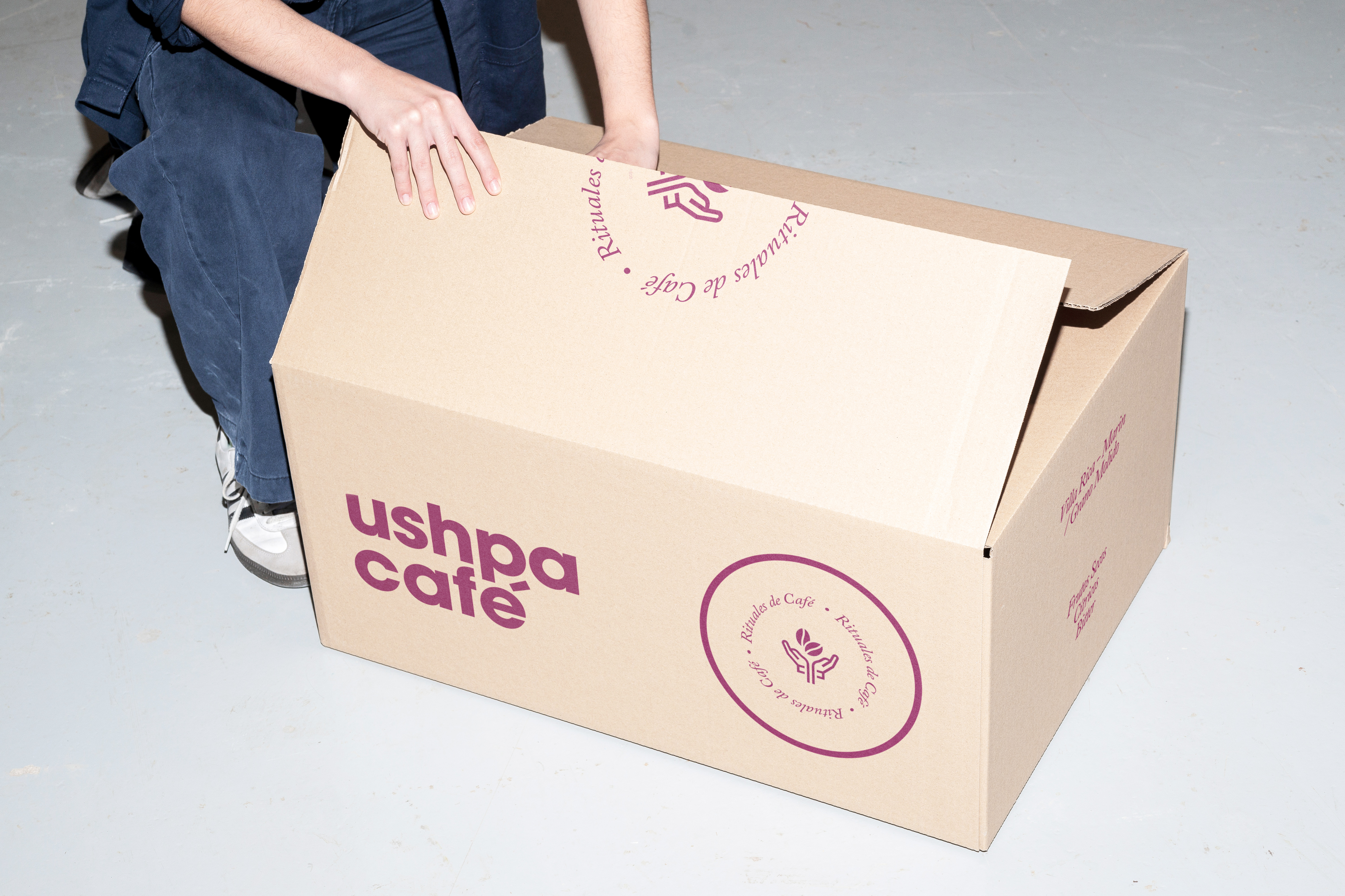
Ushpa Café is a branding project rooted in Peru’s culture and natural landscape. Created for a Lima-based café that sources its coffee locally, the name comes from the Quechua word ushpa, meaning ash. Drawing inspiration from Peru’s rich biodiversity (shaped in part by the Amazon), the visual identity centers on hand-drawn illustrations of three native Peruvian flowers: flor de retama, flor de amancay, and flor de azucena. Each flower represents a different coffee strain, coming together to form a vibrant, grounded, and unmistakably Peruvian identity.